

In the dynamic landscape of fundraising and donor management, leveraging data effectively can be the difference between success and stagnation. Take it from someone who knows - that’s Becca, our Quality Assurance Analyst, who worked in fundraising before joining Donorfy. She understands the importance of not just collecting data, but also visualising it in a way that yields actionable insights and makes it easy to understand. Here, she talks you through what’s new, her top tips for success and her favourite visualisation.
What can you visualise?
Using lists on Donorfy, you can view and analyse your data in two different ways:
- Data tab - view your data as a list
- Visualisation tab - create a visual representation of your data
Under the ‘Visualisation’ tab in the results section, you‘ll see two boxes - ‘Display’ and ‘Measure’.
- Display - this is what you’d like to summarise (also known as a categorical or qualitative data). This data is normally represented by a word. Some examples would be campaign, fund, constituent type, and gender.
- Measure - aggregate this column (also known as numerical or qualitative data). This is data in numerical form. Some examples would be amounts (gift, payment, allocation) and research scores.
So, what does that all mean? Well, essentially, to create a nice chart using your data, you need to choose a category you’d like to display, and a number you’d like to measure.
You choose what you’d like to display and measure from your selected columns, found under ‘Available columns’.
As measure is giving you a numerical value, you can choose from the following:
- Sum
- Count
- Average
- Highest
- Lowest
I'll discuss some examples at the end of this article.
What are your visualisation options?
- Pie Chart
- Line Graph
- Bar Chart
- Value
Value works slightly differently to our other options, you only need to choose what you’d like to measure.
You may choose to add thousand separators, show the value as money by adding a currency symbol, and add decimal spaces.
You can also choose to change the size of the text which shows the value.
Tips, tricks, and shortcuts:
Right click on or near your visualisation to copy the chart/graph ready for pasting into another document, such as a finance or trustee report.
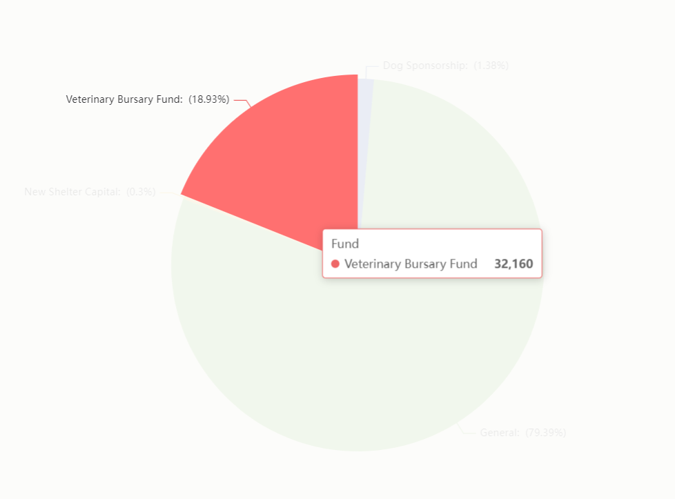
Once you’ve created your visualisation, you can hover over the relevant pie segment or bar to see the specific measurement for that data. Like this:
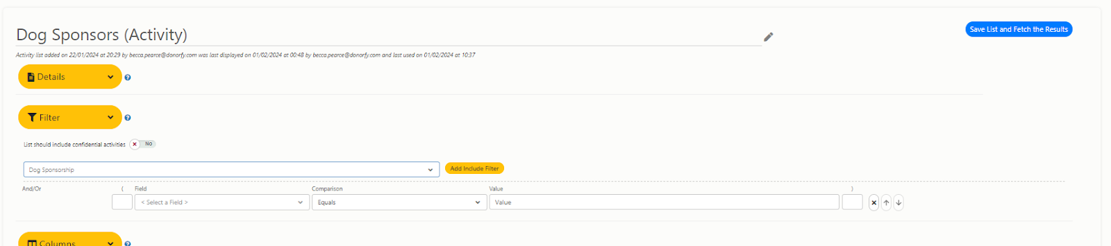
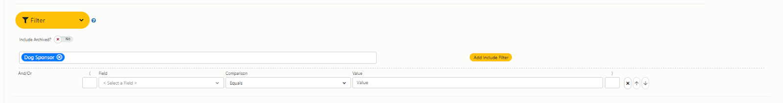
You can use activity and tag custom fields in your visualisations, so you can create some really insightful representations of your unique data. There are two key things to note:
- You can pull custom text and number fields into your visualisation.
- Make sure you select a specific activity or a specific tag when creating your list, and save! This step ensures you can view and use your custom fields. See the below pics for what this should look like.
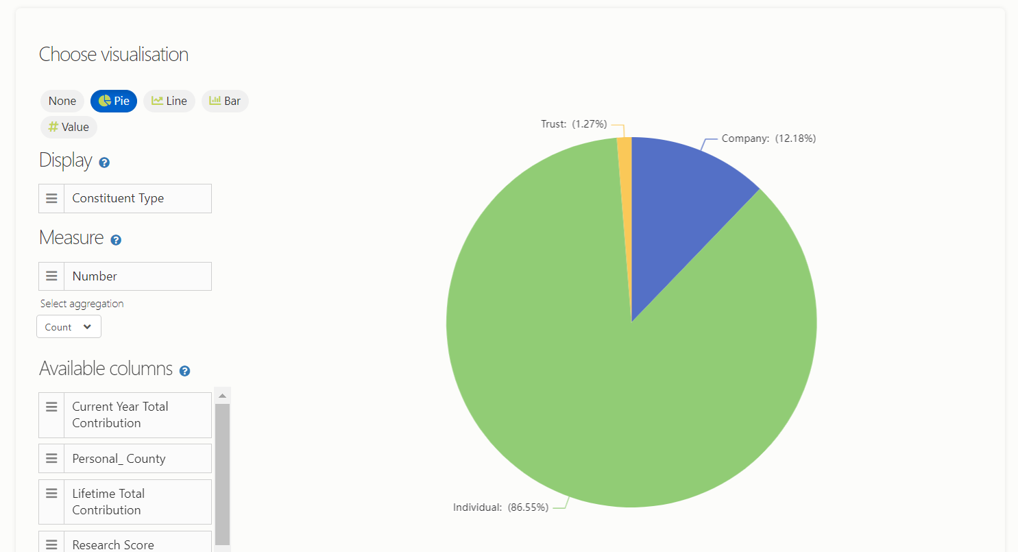
If you want to count the number of constituents in a particular category:
- Use a constituent list
- Include the column ‘Number’
- Your measure will be ‘Number’ using the ‘Count’ aggregation.
- Your display will be the category.
A couple of examples of where you might use this:
-
How many constituents you have of each type (see image below)
- Display = Constituent Type
- Measure = Number (Count)
-
Where are your donors living
- Display = Personal County
- Measure = Number (Count)
Examples of Visualisations
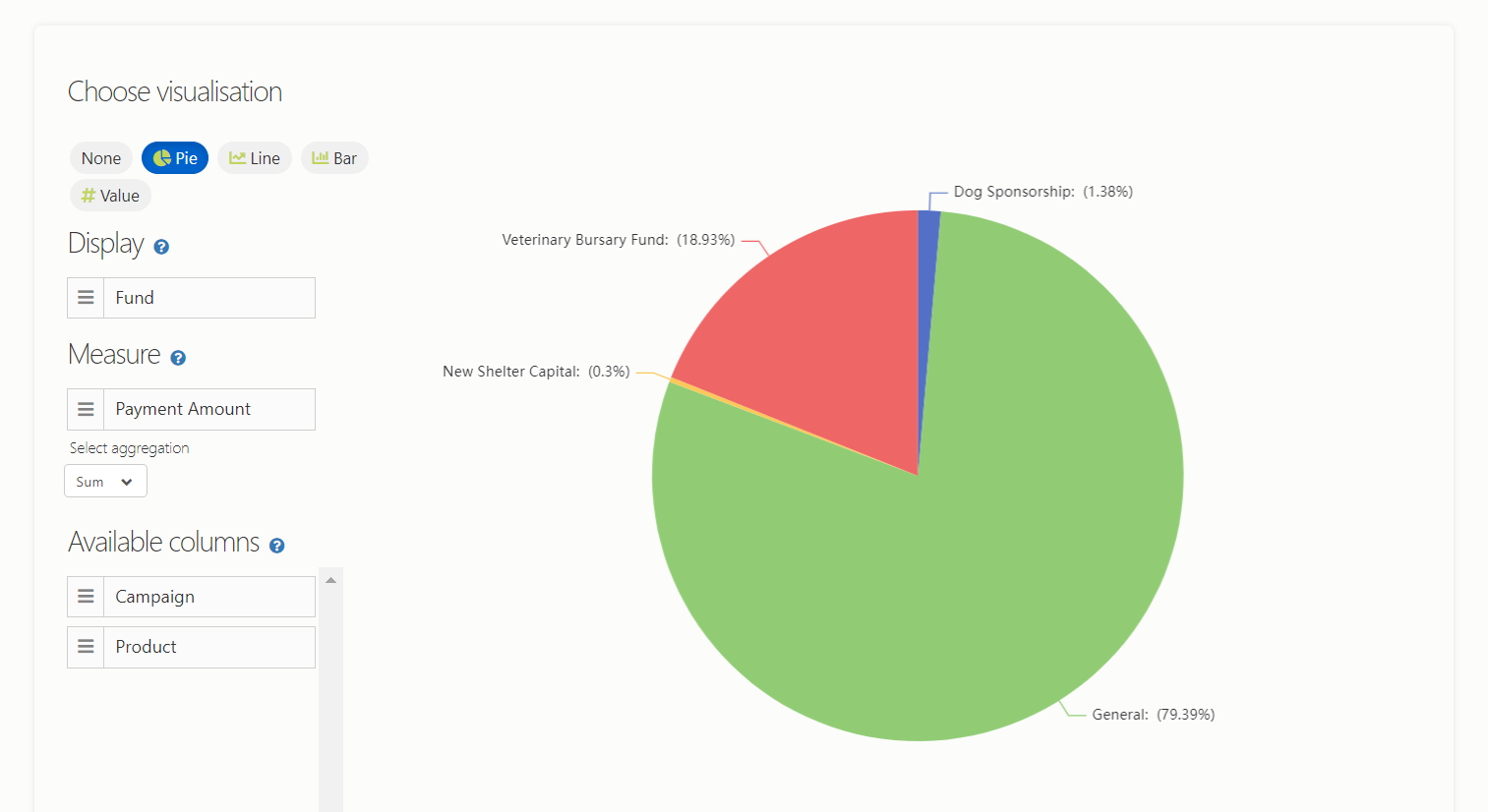
‘I would like to see how much income we have in each funding pot’
We can break this down into:
- Display = ‘each funding pot’ = Fund
- Measure = ‘how much income’ = Payment Amount (Sum)
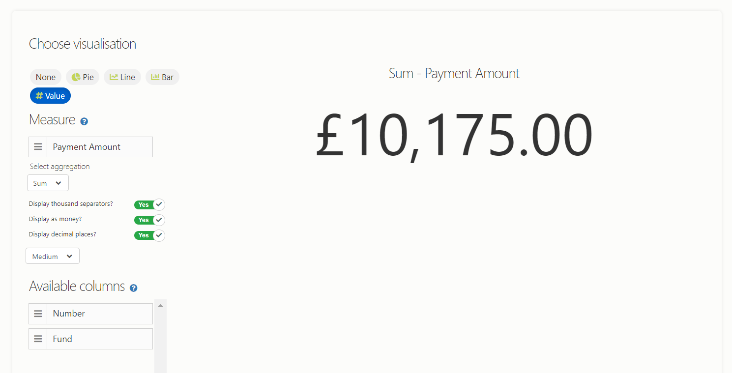
‘I want to quickly check the total income for this quarter on a regular basis’
The two key things here are:
- Use the ‘value’ visualisation
- Measure = Payment Amount (Sum)
- ‘On a regular basis’ = lock the list (ensure nobody changes your visualisation!)
- Make sure you’ve entered the correct dates into your filter, using the ‘between’ comparison)
Finally, Becca's Favourite ...
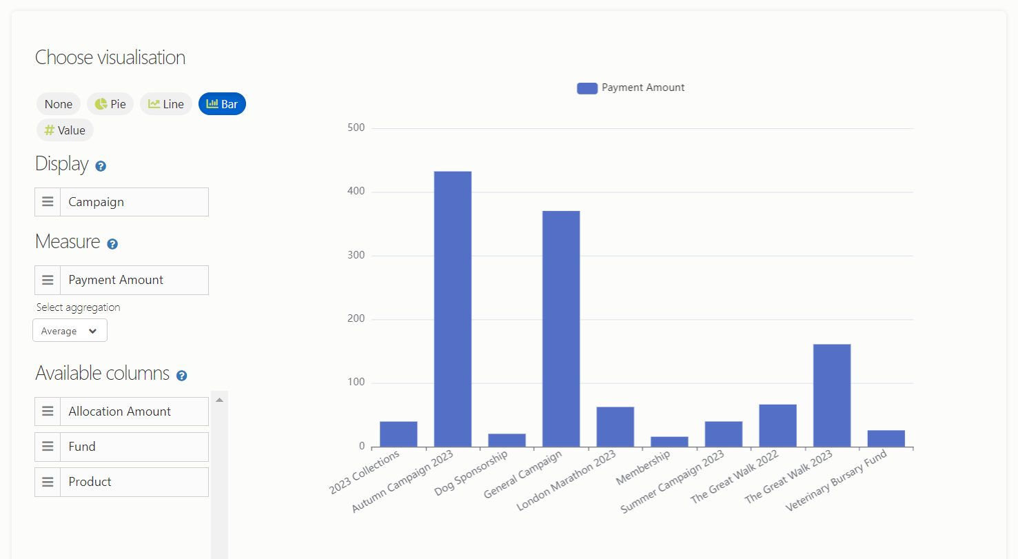
‘I would like to know which campaigns delivered the highest average donation’
This my favourite because, at a basic level, it gives you a quick understanding of what’s working well and what’s working less well; it's a great diving off point to explore that in more detail. Using the campaign analytics on Donorfy, you can then analyse donor acquisition, donor retention, highest gifts, average gifts, etc, some of which you can also subsequently pull into lists and visualisations.
We can break this down into:
- Display = Campaigns
- Measure = Allocation Amount (Average)
So, on Donorfy this looks like:
About the Author
With a wealth of charity experience, including fundraising for Medical Detection Dogs, Becca tests Donorfy with the keen eye of a fundraiser. When she's not ensuring Donorfy runs smoothly, you'll find her wrangling dogs and hitting the ice as part of an ice hockey team.


.png?width=534&height=220&name=Reporting%20Blog%20Banner%20(1).png)

.png?width=992&height=442&name=Support%20Team%20(2).png)